
The concept actually came to me a few months ago, when I had the foresight to draw a quick thumbnail of it:

Written around this thumbnail were a couple of hand-written notes about how to improve the composition and such. Even so, the composition of the paint-sketch I did a few days ago also needs improvements before I can continue on to the final painting.

Welcome to Tangent Central Station!
Untangling this mess is going to be a bit of an effort. The zombie slug in the foreground is something I felt needed to be there in order to create some depth, but it causes a number of problems, namely: overlapping Mr. & Ms. Slug is likely to result in a tangent no matter where I put it, but that overlap helps to create the depth I was looking for; I worry that overlapping Mr. & Ms. Slug too much will cut them off from the bottom of the canvas, causing them to appear to be "floating" in the composition, rather than anchored to an unseen ground plane. Some other places of concern are the top edge of the middle-ground zombie slug's body as it passes behind Mr. & Ms. Slug, and Ms. Slug's elbow protruding in front of Mr. Slug's armpit. Both of these can be solved by some repositioning; heck, maybe changing those will alleviate the problems coming from the foreground slug.

Currently, the middle-ground zombie slug is pulling too much attention in the composition. I think this may be due to two things: one, I inadvertently gave him more detail than the other zombie slugs; two, he has more "levels" of lighting than the other zombie slugs. Together, this gives him more visual information than the other slugs, drawing the attention away from the high-contrast areas I had originally intended as areas of focus. I think toning down the lights on him alone will help significantly.

Mr. & Ms. Slug's heads are possibly too simplified. Their heads just don't say "slug" to me. They need more fat to them, more mass. I think having a bit of a bulge at the necklines would be a plus. The "lip" also needs to be better defined:

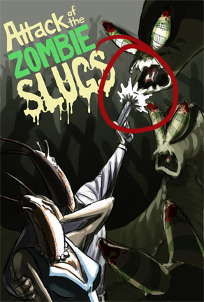
This area is too cramped. There needs to be more space between the end of the gun and the attacking zombie slug

Mr. Slug's arm is seriously awkward. It has a terrible silhouette. I plan to have some friends pose for me so I can get the anatomy and clothing folds right in the final version; with any luck, the reference will also give me better ideas on what to do with Mr. Slug's arm.

The folds on this sleeve way too evenly spaced. Having photo/life reference will help here.

Probably wouldn't hurt to have more space between the U and the G for readability purposes.
Some final small notes... I need to bounce around the red that's on the zombie slugs' antennae. I'm thinking maybe a bit of blood on Mr. or Ms. Slug. There will be some faint red coloration on the background zombie slugs in the final, though, so that might be enough -- something to test before starting the final. The other small note would be to improve the grouping on the background zombie slugs. They serve the composition fairly well as they are, but the grouping could definitely be better.
This probably won't be the last people-with-bug-heads piece I do. Sitting next to the Attack of the Zombie Slugs thumbnail is...

Mantis and Slug Miss Take-Off
Any additional critiques are, of course, very welcome.
No comments:
Post a Comment