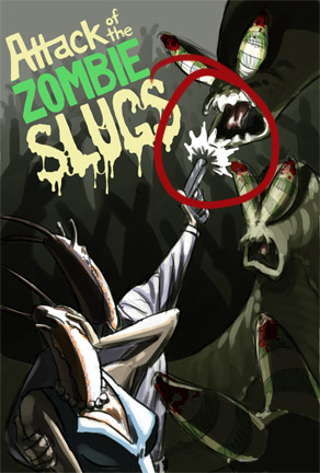
ATTACK OF THE ZOMBIE SLUGS -- a Self-Critique

Wednesday, January 12, 2011

So, a few days back, I created quick sketch/paint on a whim:


The concept actually came to me a few months ago, when I had the foresight to draw a quick thumbnail of it:


Written around this thumbnail were a couple of hand-written notes about how to improve the composition and such.  Even so, the composition of the paint-sketch I did a few days ago also needs improvements before I can continue on to the final painting.


Welcome to Tangent Central Station!  

Untangling this mess is going to be a bit of an effort.  The zombie slug in the foreground is something I felt needed to be there in order to create some depth, but it causes a number of problems, namely: overlapping Mr. & Ms. Slug is likely to result in a tangent no matter where I put it, but that overlap helps to create the depth I was looking for; I worry that overlapping Mr. & Ms. Slug too much will cut them off from the bottom of the canvas, causing them to appear to be "floating" in the composition, rather than anchored to an unseen ground plane.  Some other places of concern are the top edge of the middle-ground zombie slug's body as it passes behind Mr. & Ms. Slug, and Ms. Slug's elbow protruding in front of Mr. Slug's armpit.  Both of these can be solved by some repositioning; heck, maybe changing those will alleviate the problems coming from the foreground slug.


Currently, the middle-ground zombie slug is pulling too much attention in the composition.  I think this may be due to two things: one, I inadvertently gave him more detail than the other zombie slugs; two, he has more "levels" of lighting than the other zombie slugs.  Together, this gives him more visual information than the other slugs, drawing the attention away from the high-contrast areas I had originally intended as areas of focus.  I think toning down the lights on him alone will help significantly.


Mr. & Ms. Slug's heads are possibly too simplified.  Their heads just don't say "slug" to me.  They need more fat to them, more mass.  I think having a bit of a bulge at the necklines would be a plus.  The "lip" also needs to be better defined:


This area is too cramped.  There needs to be more space between the end of the gun and the attacking zombie slug


Mr. Slug's arm is seriously awkward.  It has a terrible silhouette.  I plan to have some friends pose for me so I can get the anatomy and clothing folds right in the final version; with any luck, the reference will also give me better ideas on what to do with Mr. Slug's arm.


The folds on this sleeve way too evenly spaced.  Having photo/life reference will help here.


Probably wouldn't hurt to have more space between the U and the G for readability purposes.

Some final small notes... I need to bounce around the red that's on the zombie slugs' antennae.  I'm thinking maybe a bit of blood on Mr. or Ms. Slug.  There will be some faint red coloration on the background zombie slugs in the final, though, so that might be enough -- something to test before starting the final.  The other small note would be to improve the grouping on the background zombie slugs.  They serve the composition fairly well as they are, but the grouping could definitely be better.

This probably won't be the last people-with-bug-heads piece I do.  Sitting next to the Attack of the Zombie Slugs thumbnail is...


Mantis and Slug Miss Take-Off

Any additional critiques are, of course, very welcome.

Happy New Year!

Monday, January 3, 2011

Well, hello there, 2011.  I hope you're settling in well.  I have to admit, my relationship with your elder sibling was not the greatest.  Here's to hoping you'll provide me with less illness, and more art production!

Here are some tidbits from last quarter of 2010.

To start with, here are the thumbnails from Scene 02 of "Overtures."


And here's the thumbnails for the pages of Scene 03 that I've completed thus far.  I'll post the others later, once the final pages are posted on www.altairuniverse.com 


At the Universe of Altair, the site where "Overtures" is displayed, we have a Map Room which is slowly but surely being filled up with maps from the fictional setting "Overtures" takes place in.  To help spruce up the world map, I made some sea monsters to put on it.


And here's the map.  I made this a while ago... Wanna say a little over a year ago, but at the time it didn't have any of the names on there.  Tom took the time to put all the names in place himself, which is pretty awesome!  I added the sea monsters and compass rose a few days ago.


You can see a larger version of the map by visiting www.altairuniverse.com and going to the Map Room section of the website (it's in the Compendium menu).

Here are some sketches I did for a creature design idea.  I was trying to combine a Long-Tailed Pangolin and a European Bee-Eater.  I haven't uploaded all my sketches because my sketching gets pretty nasty; since this is my exploration phase, I don't give two toots about making my drawings pretty.  Or having them make sense to anyone other than myself.  One of these days, I'll get around to doing an illustration of the final designs I came up with.


My first sketches are always littered with reference drawings.  I'm very particular about wing and tail anatomy on birds, and make a point to refresh my memory every time I need to draw them.


And this is the little fellah I decided would be my final design for the chick form of this combi-species.  The adult will be based on the small thumbnail with "adult" written below it in the image above.


I revisited Ugly Vamp one afternoon, and started rethinking UV's appearance.  I also developed Mum's design a bit more.  Hunch-backed, Igor-esque women are CRAZY fun to draw.


Here's a random painting I did in pchat, a java-based painting program that allows multiple people to work on a canvas at the same time.  While others were drawing pretty ladies and majestic dragons, I was in my own little corner, creating this little guy:

I had a photo for reference, but unfortunately the lighting and focus on it wasn't very good.  I've since researched mantis anatomy and learned that the mandibles I painted here are incorrect.  Mantis' mouths are quite complex, but very cool!  I'll have to post my reference drawings sometime for anyone who might be curious.

And lastly, I finally got around to picking at my slimy meatball painting again.  I adjusted the lighting, as suggested by a friend, who rightly pointed out that my highlights were too large and too "hot" on my previous attempt.  The same friend has already given me further suggestions on my newest version; hopefully it won't take me another four months to get around to using them ;)


Toodles, everybody!  Maybe I'll post more frequently in 2011, hur hur hur!

Bad Hair Day

Saturday, September 11, 2010

I took a shot at painting some human hair today.  It didn't go so well.  I think I need to go study a bunch of hair styles to see how the volumes of hair fall.  One of my big mistakes this time around was treating some volumes like snakes rather than thick planes.


I'll take another whack at it tomorrow and see how it goes.  Hopefully, with what I've learned tonight, I'll do a little better next time!

Last night, I painted up a furball with mange.  Could've been better, but I don't think it's too bad.

Paint Chat

Friday, September 10, 2010

Yeah, so I gave pchat a whirl today.  It's... Different.  Being limited to only 2 layers makes me much more cautious about laying down "paint" and experimenting (there's also no Undo button!  Oh noes!)  It's not bad, though.  I just wish I could draw better with a tablet!

Anyhoo, I did this right quick just to get used to the application.

Go go, cheesy sunset scene!

Furball #4

Wednesday, September 8, 2010

Took a little time out of my afternoon to paint another furball.


I seem to have a habit of making the shadows between fur clumps too dark.  Aside from that, I do think this is an improvement over my previous attempts.  A friend, Jason, has suggested I make a furball with mange, which sounds like a fun challenge.

Paintballs

Tuesday, September 7, 2010

Hello, ladies and gents!

In my on-going journey to become a better artist, I've begun a series of studies.  It started with a meatball.

I thought, "What would a steak look like if you squeezed it into ball form?  How would subsurface scattering affect the appearance of the ball, and what sort of textures would be found on its surface?  How does fat marbling actually look?"  And so on.  I decided to add on top of it a translucent skin in order to study how translucency works, and on top of THAT some clear slime to help me understand how reflections work on liquid surfaces.

So, here's how it started:


After receiving a few helpful comments from friends, I set off on improving my meatball.  I also took a swing at some translucent skin.

Top left: old version, top right: new version, bottom: new version with skin.
Again, friends came to my aid and provided some excellent observations with which I could further improve my meatball.  It seemed like most people were mistaking the skin for ice, which turned out to be because of the high amount of specular.  The meatball itself seemed to please people, but I felt the specular pattern on the meat's surface wasn't quite right.

Which brings us to the most current attempt:


I'm pretty happy with the meatball at this point, and the skin.  However, the veins could use a bit of help and the slime could use a LOT of help.  Fortunately, my friends have once again come to the rescue.  I'll be making corrections once I find the time and the itch to work on the meatball again.

In the mean time, I've decided to start on practicing fur and hair.  Saving hair for later and starting with fur, I've made these three attempts.


My first try wasn't horrible, but definitely needed help.  I'd managed to grasp the idea of fur forming into clumps instead of remaining a bunch of individual little hairs, but the size and spacing of the groups were too uniform.  In a way, the first attempt came off to me as feathers more than it did fur.

The second try was an attempt to overcome the even spacing/size issue... But failed horribly, probably because I did not remain focused while painting (yes, artists have to use their brains!  My goodness!)  I felt that the fur looked striped, rather than appearing to be rings of fur on top of one another.  I believe this is because I did not blend the shadows properly into the fur.  Alas.

The third try is... getting there.  I clearly still need to work on my fur painting skills, but I feel like I'm starting to get a grasp on certain properties of fur.

Anyway, I'll still be working on the meatball and furball again when I find the time.  Once I am happy with my fur-painting abilities, I will start trying out hair.

A Random Find

Tuesday, August 3, 2010

Do you ever go looking through your old files and find a piece of artwork that makes you think, "When did I make this?  And why did I forget about it?  It's kinda cool."

I found one of those pieces today while selecting my new 2D portfolio collection.  Not sure if it's worth putting in the ol' portfolio, but I figured it might be fun to show here:


Some of the color choices could've been better, but eh, I like it.  Maybe I'll make a new version of it sometime.